

KIMBERLY AKIMBO to Broadway this Fall!
VintageSnarker
Broadway Legend Joined: 1/30/15
#100KIMBERLY AKIMBO to Broadway this Fall!
Posted: 6/11/22 at 4:30pm
I can certainly see why they would have moved away from the original imagery. It's a little sterile and it feels like the art for those plays that (hopefully) don't spend a lot on marketing. But the hourglass and the fallen tile communicate so much more than the new logo which yes, does feel like it evokes Pride if you don't know what it's referencing. Tricking the audience is fine but given the language, familial drama, and the fact that only two ensemble characters are gay, I could see audience members being disappointed if they went in not knowing what the show was about. I think there was a middle ground where they could have illustrated the original hourglass and scrabble tiles.

ErmengardeStopSniveling
Broadway Legend Joined: 9/20/18
OhHiii
Broadway Star Joined: 4/30/16
#102KIMBERLY AKIMBO to Broadway this Fall!
Posted: 7/9/22 at 4:02pm
ErmengardeStopSniveling said: "Artwork looks a little better in this context."
err…question for the group…how many joints does one typically have in one’s thumb? Because…well just look closely.
#103KIMBERLY AKIMBO to Broadway this Fall!
Posted: 7/10/22 at 12:56pm
I missed the extra thumb joint. This is a double yikes compared to the Great Adventure rainbow.
Oh well. My triple jointed fingers are crossed that Vicky gets a Tony nom.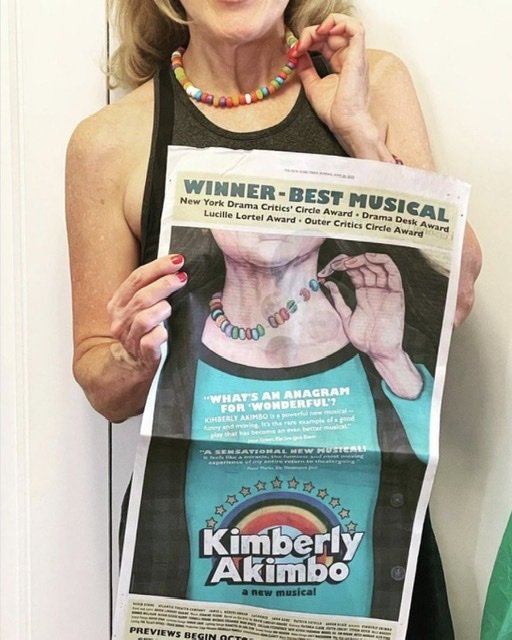
RippedMan
Broadway Legend Joined: 8/14/05
#104KIMBERLY AKIMBO to Broadway this Fall!
Posted: 7/10/22 at 2:54pm
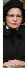
Yeah I actually like it in that context. Like an older woman trying to play young perfectly depicts the show.
OhHiii
Broadway Star Joined: 4/30/16
#105KIMBERLY AKIMBO to Broadway this Fall!
Posted: 7/14/22 at 8:32am
RippedMan said: "Yeah I actually like it in that context. Like an older woman trying to play young perfectly depicts the show."
Alas, Victoria Clark won't be standing by every ad to give the artwork context.
Videos